National Marine sanctuaries 50th anniversary mock logo
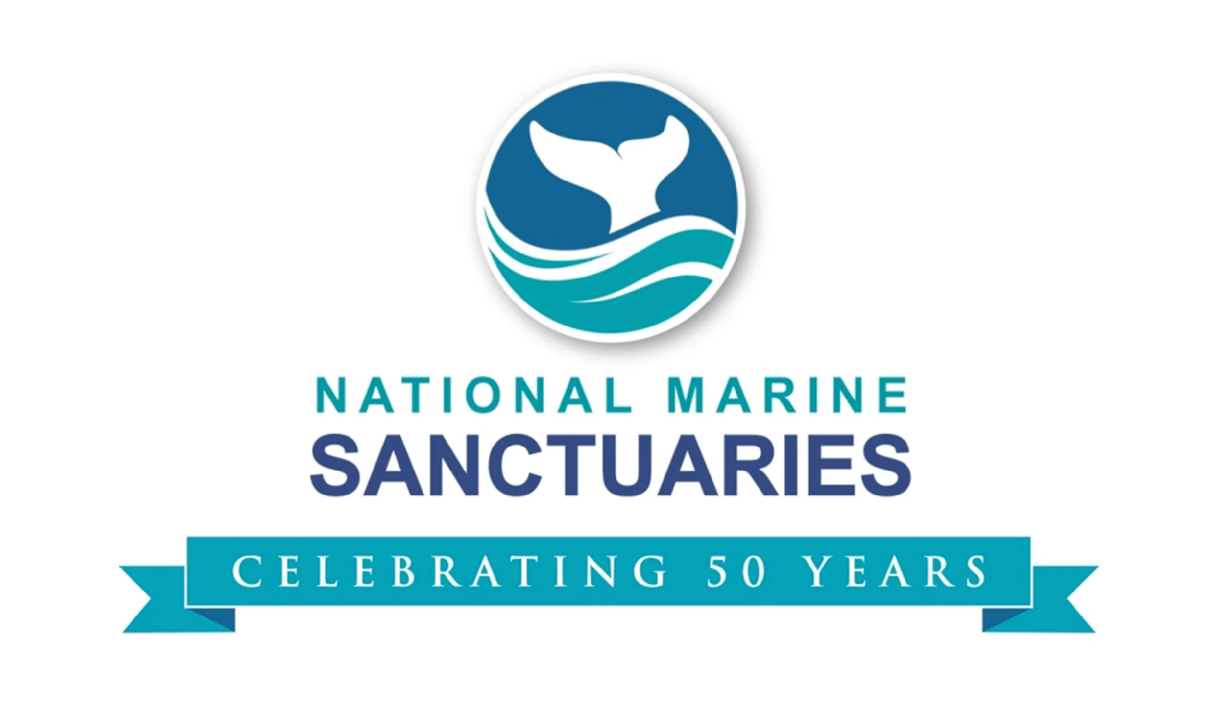
Original Logo
The National Marine Sanctuaries logo has an outdated aesthetic that does not align with modern branding standards. A more streamlined and contemporary design would enhance its effectiveness and recognition. While it aims to represent marine life and conservation, its execution lacks a strong, memorable connection. Additionally, intricate details, -especially the text- do not scale well, reducing its versatility across different mediums. A simpler, more adaptable design would improve clarity and impact.
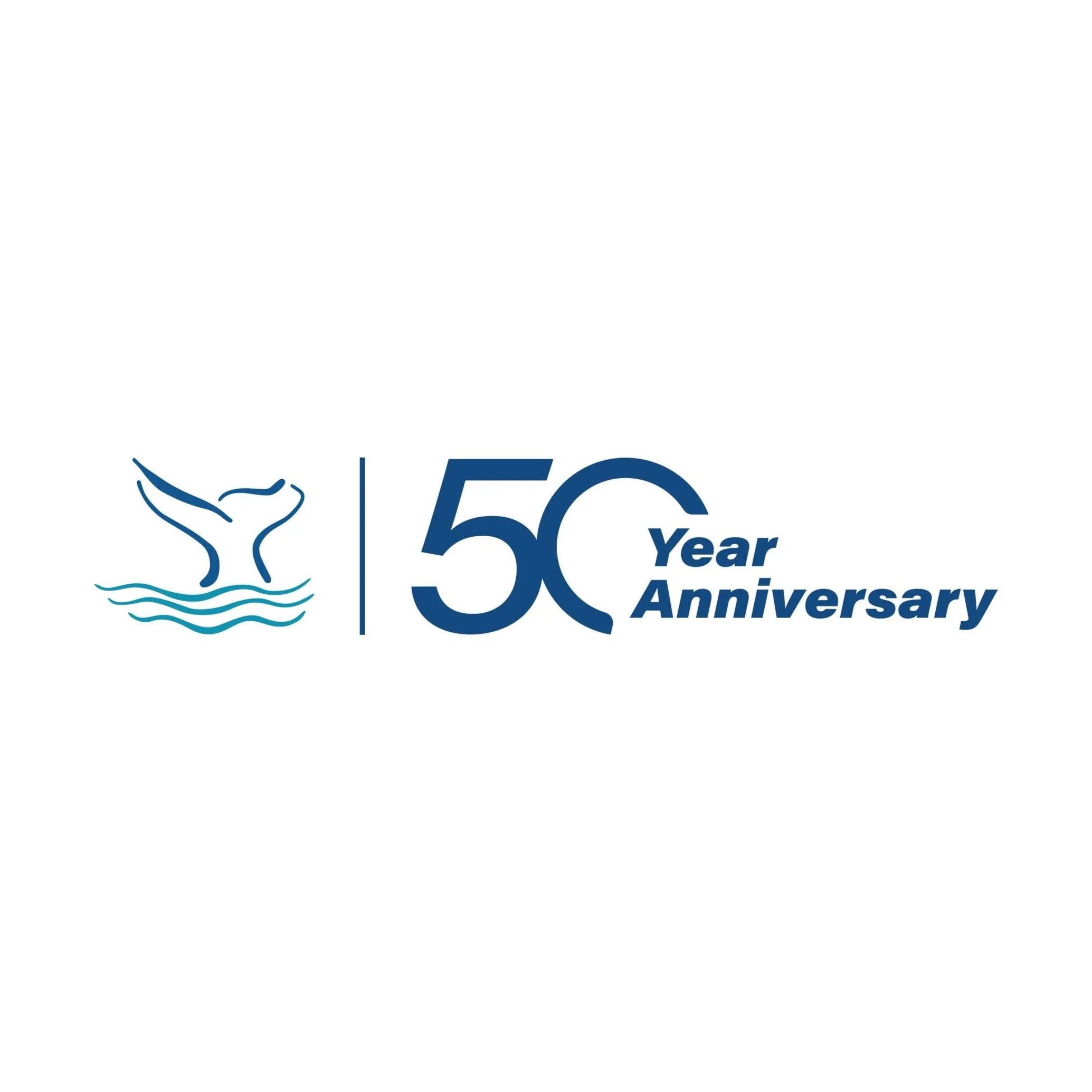
Logo redesign
My National Marine Sanctuaries 50th Anniversary logo redesign preserves the iconic whale tail from the original logo while enhancing scalability and impact. The 50th Anniversary element is bold and prominent, ensuring scalability across various applications. By retaining the brand’s signature navy and teal color scheme, the design maintains a strong connection to the organization’s identity. This update modernizes the composition while honoring the legacy of the original mark.

